HEP Carbon · 2024
HEP Carbon
HEP Carbon makes ultralight carbon fibre hunting equipment trusted by serious hunters across Europe. The product was exceptional. The website made it invisible.
Visit live siteMeta
The business problem
When the product is premium and the site says otherwise
HEP Carbon sits at the top of a niche. Carbon fibre bipods, load carriers, and hiking poles for hunters who move through mountain terrain and need equipment that does not fail. The buyer is knowledgeable, deliberate, and price-tolerant because weight and reliability matter more than cost.
The existing Shopify store communicated none of that. Eleven navigation categories exposed at once, no brand statement, no editorial framing, and a visual identity indistinguishable from a budget outdoor goods reseller.
The business needed a site that converted considered buyers, not bargain hunters. Those are fundamentally different design problems.
Stakeholders
Needed the site to reflect the quality of what they build and justify a premium price point to buyers arriving from search or word of mouth.
Arrives with specific technical knowledge. Needs weight specs, material callouts, and use-case clarity before committing. Does not respond to promotional pressure.
Less expert, guided by brand signals. A site that looks premium gives them confidence to spend. Needs clear category navigation above all else.
The design problem
Eleven categories at once is not navigation. It is noise.
The existing navigation presented the full product taxonomy on arrival — load carriers, hiking poles, bipods, rifle slings, knives, shoes, cases, and accessories all visible before a visitor had formed any orientation to the brand. When everything is equal, nothing is findable.
The homepage offered no editorial moment. No statement of what HEP Carbon believes about hunting gear, no signal of the material obsession behind the product. It opened directly onto a product grid.
Before / After
My approach
The positioning problem had to be solved before the layout
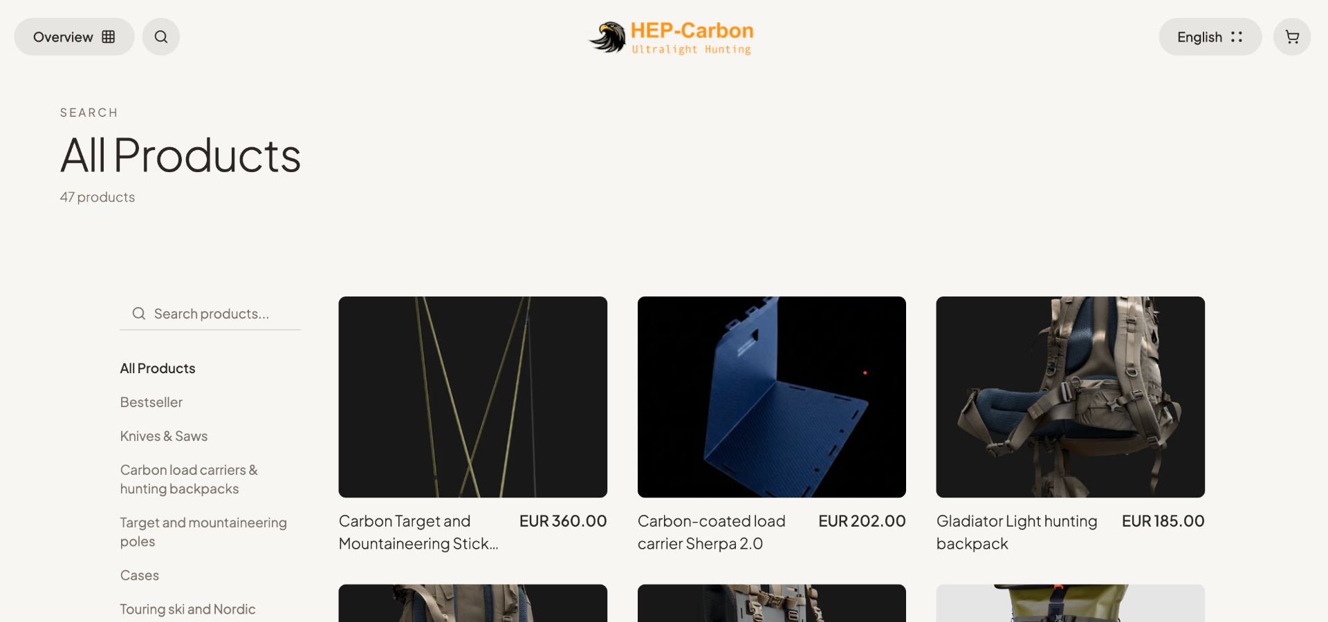
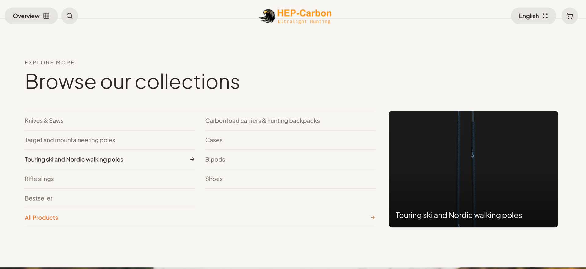
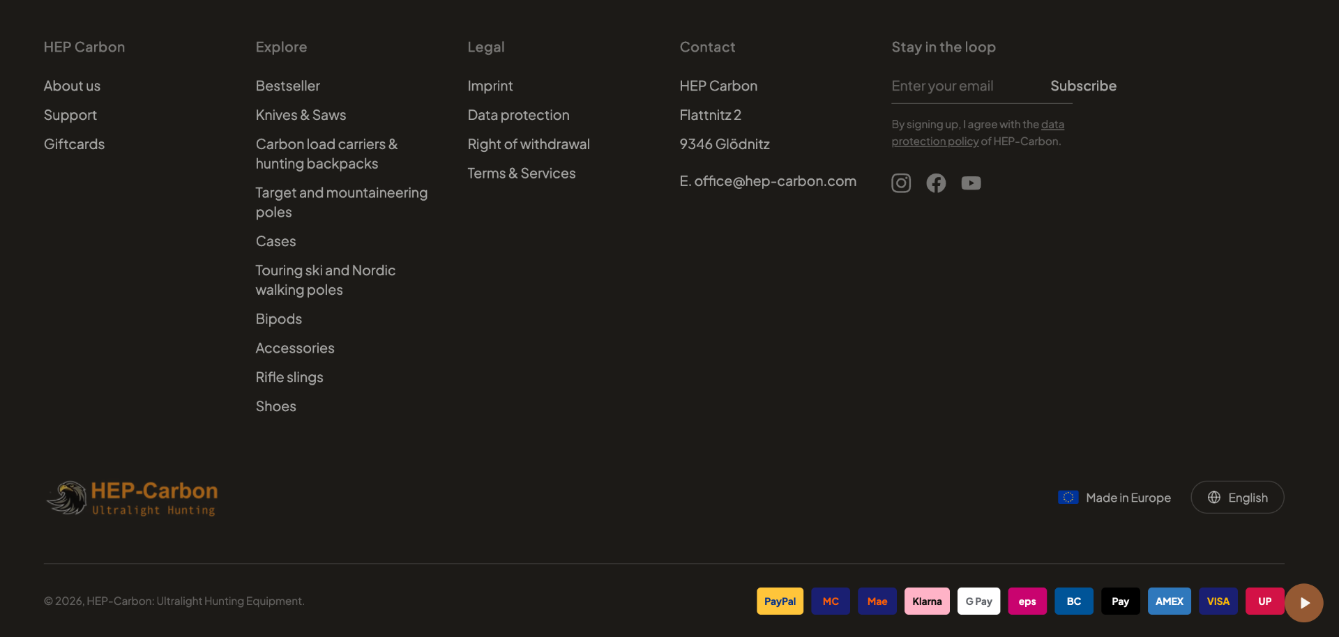
Before any visual decisions were made, the information architecture was reduced. Four categories replaced eleven — a recognition that the range, understood correctly, falls into four groupings that match how a hunter thinks about their kit. The previous taxonomy reflected warehouse logic, not buyer logic.
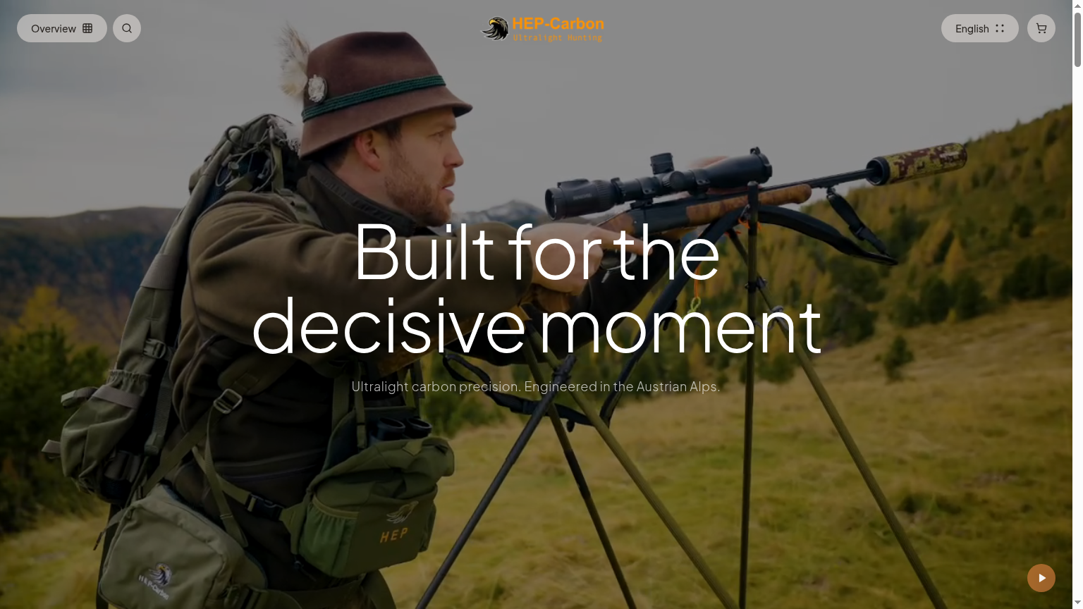
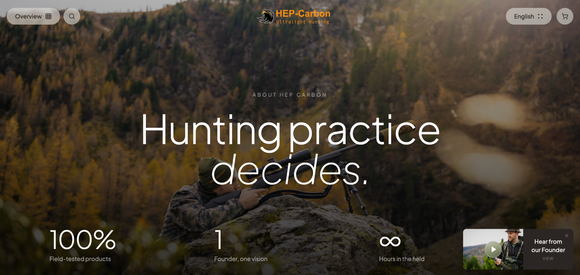
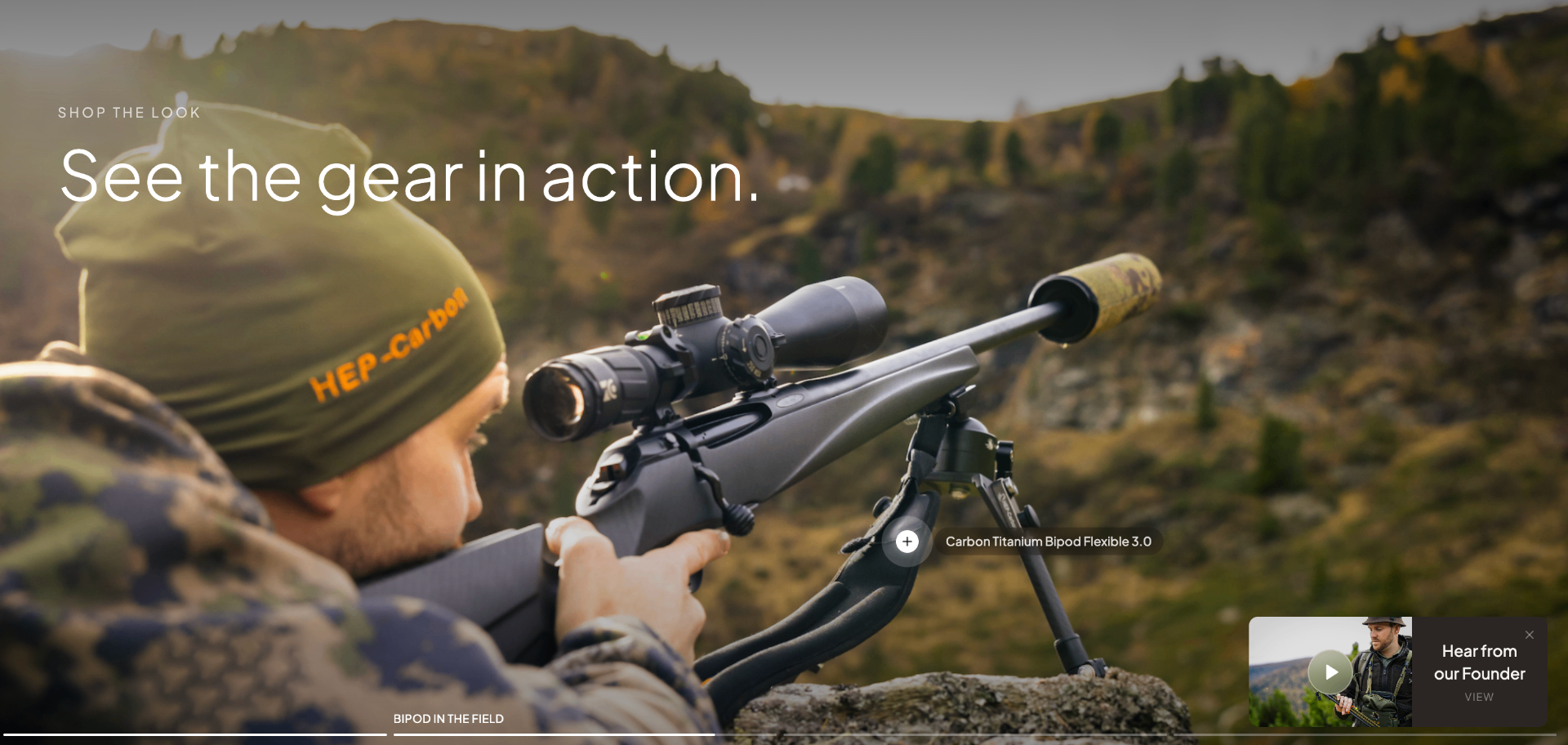
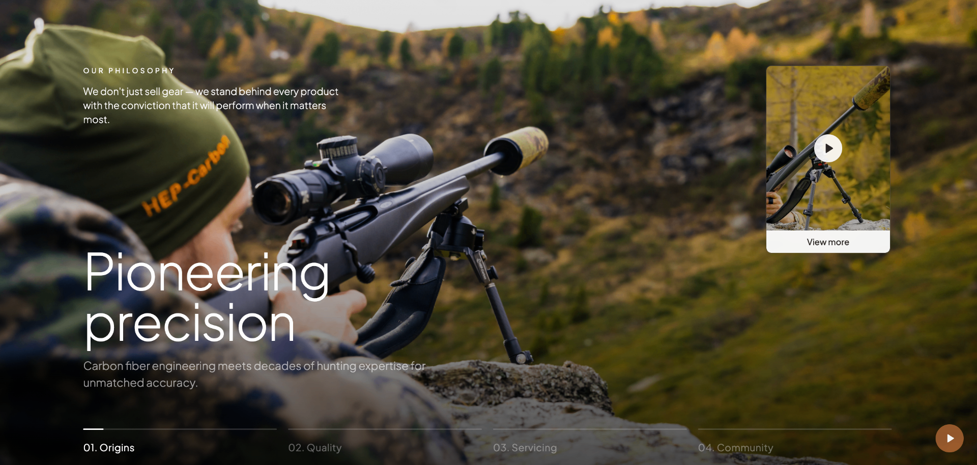
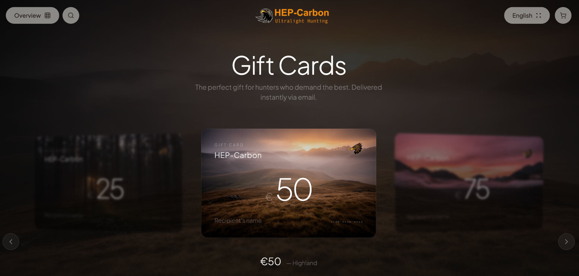
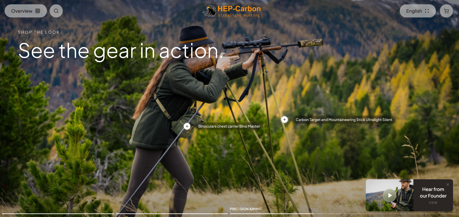
The visual language was drawn from high-end precision equipment publishing rather than e-commerce convention. Dark field photography, generous space, restrained typography, no promotional mechanics.
Design decisions
Navigation reduction
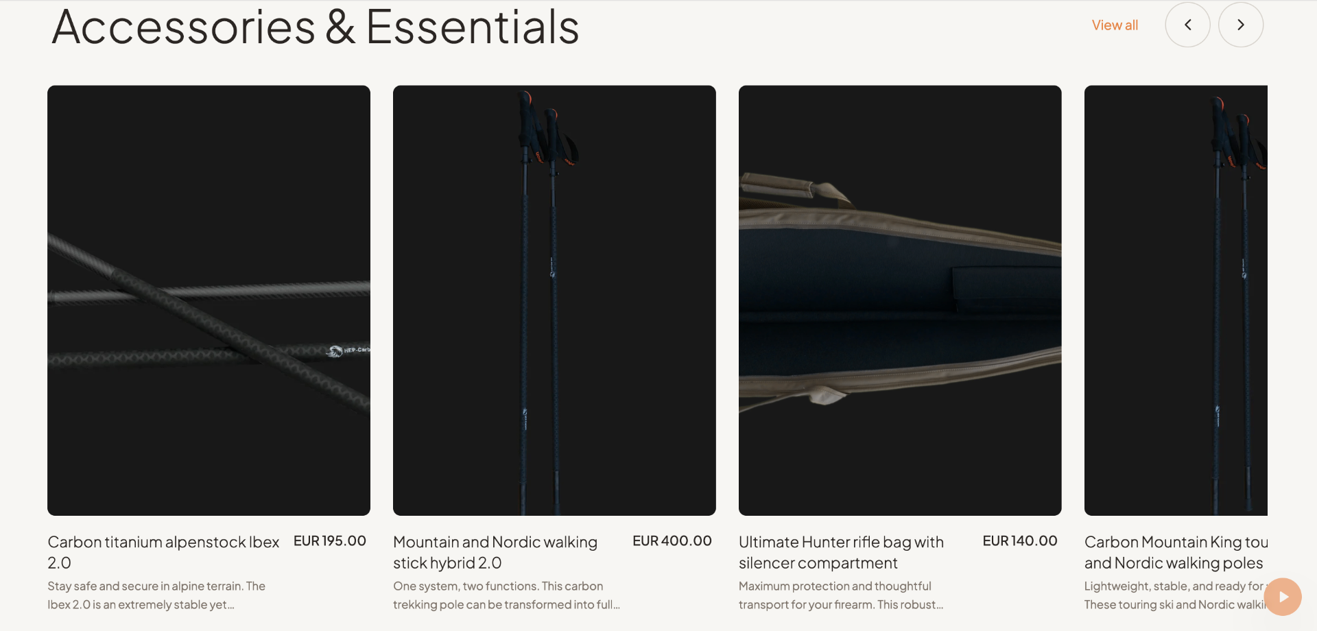
Eleven categories became four. Buyers who know what they want find it in one click. Those who do not land on bestsellers first and build orientation from there rather than from a wall of simultaneous options.
Brand statement before product
The hero establishes what HEP Carbon is before showing what it sells. Premium considered buyers self-qualify with a brand before evaluating a product. Skipping that step was costing trust at the first moment of arrival.
Editorial restraint as trust signal
No discount banners, no countdown timers, no promotional urgency. For a buyer spending several hundred euros on gear they will carry for years, promotional mechanics communicate exactly the wrong things.
Copy written in English, not translated into it
The previous site read as German product descriptions passed through translation. The new copy was written directly in English with the buyer's knowledge and register in mind.
Outcome
The redesigned site positions HEP Carbon where the product already belongs: alongside specialist precision outdoor brands, not budget hunting supply stores. It gives the serious buyer a reason to trust before a reason to buy.